
Understanding Tenor Analytics
Tenor Analytics helps Admins understand how their organization is using Tenor — including overall activity, roleplay engagement, learning progress, and coaching usage.
By reviewing these metrics, you can gain a clearer picture of adoption across your workspace and identify where learners may benefit from additional practice or support.
This article is a reference for what each metric means.
📝 Note: Tenor Analytics is only available to Admins.
How to View and Understand Analytics
To review your workspace analytics, navigate to Admin Dashboard → Analytics.
From here, you can explore key metrics across three areas:
- Overview – Tenor adoption and progress at a glance
- Roleplay – practice activity, skills, and content trends
- Coach – coaching usage and topics discussed

Quick Stats
Quick Stats are the top 3 metrics shown at the top of each Analytics tab.
Each Quick Stat includes a small indicator showing how the metric changed compared to the previous time period. Hover over the indicator to see the exact difference.

Active Users Over Time
A line chart showing engagement trends across the selected date range.

How Time Periods and User Filters Work
Analytics reporting is based on the date range and user filters selected at the top right of the dashboard.

Defaults
- Date range: Last 30 Days
- User Filters: None (no filters applied)
Date Range Options
- Admins can choose from several preset date ranges (for example: Last 7 Days, Last 30 Days, or All Time) — or set a Custom Range.
Available User Filters
- You can filter Analytics reporting by different user attributes (for example: Department, Job Title, or User Group).
Previous Period
- For Quick Stats, User-Value Survey Responses, and Skill Averages, Tenor compares the current period to a previous period. How the previous period is determined depends on the date range you selected:
- Last 7 Days, Last 30 Days, or a Custom Range: Compares to the immediately preceding date range of the same length. For example, if you select Last 7 Days, it compares to the 7 days before that.
- This Month or Last Month: Compares to the previous calendar month.
- Year to Date: Compares to the full previous calendar year.
- All Time: No previous period comparison is shown.
Persistence Across Tabs
Your selected date range and user filters persist across the Overview, Roleplay, and Coach tabs until you change or clear them.
💡 Note: If a filtered group is too small, some charts may be hidden to protect user privacy.
Overview Tab
The Overview tab gives you a snapshot of overall Tenor adoption in your organization.

Quick Stats
- Users Active in Period – The number of users who visited Tenor during the selected time period.
- Average Leader Score – The average Leader Score across users in your organization (who match any filters applied).
- Each user's Leader Score is a composite of their cumulative performance across six leadership skills (Clarity, Conversational Focus, Emotional Intelligence, Motivation, Goal Attainment, and Problem Solving), reflecting all of their practice history up to the end of the selected time period. .
- Learning Paths Completed – The number of Learning Paths completed.
Active Users Over Time
A line chart showing engagement trends across the selected date range.
Roleplay Tab
The Roleplay tab focuses on practice activity and performance.

Quick Stats
- Roleplay Practices Completed – The total number of completed roleplay practices.
- Average Practice Duration – The average length of completed roleplay practices.
- Custom Scenarios Created – The number of unique custom scenarios created and then practiced at least once by end users. Each custom scenario is counted only once, regardless of how many times it was practiced.
- This includes custom scenarios created via:
- Coach
- Scenario Library → Create custom scenario
- Does not include scenarios created by Admins in Manage Library
- This includes custom scenarios created via:
Active Users Over Time
A line chart showing trends over time. Use the dropdown to view:
- Conversations Completed
- Conversations Retried
- Custom Scenarios Created

Most Popular Content
A pie chart showing what roleplay content is practiced most. Toggle between:
- Categories (most practiced scenario categories)
- Scenario (most practiced individual scenarios)
Skill Averages
A comparison view showing how each a user’s skill level on each leadership competency has changed over time.
- Green bars: each user’s latest skill averages at the end of the current period current period
- Blue bars: each user’s latest skill averages just before the current period started
These are cumulative averages - they reflect all of a user's practice history up to that point, not just practices within the selected date range. This means the chart shows the overall trajectory of skill development, rather than performance during a single time window.

User Value Survey Responses
A bar chart showing how users responded to the value survey after roleplay practice (and the percentage breakdown for each response option).
Top Users
A ranked list of the top six users in your organization with the most conversations practiced within the time period. Sort by:
- Conversations Completed
- Leader Score

Coach Tab
The Coach tab shows coaching engagement trends.
Quick Stats
- Total Coaching Sessions – Total coaching sessions.
- Unique # of Users Coached – Number of distinct users who used Coach.
- Roleplay Scenarios Generated – Roleplay scenarios generated through coaching sessions.
Coaching Sessions Over Time
A line chart showing coaching sessions started per day.

Most Discussed Topics
A pie chart showing the most common coaching themes, grouped into broad categories.
The 14 possible coaching topics are:
- Transitioning into Leadership
- Routine Feedback and Check-ins
- Formal Performance Reviews
- Addressing Performance Issues
- Delivering Difficult News
- Equity and Inclusion
- Team Conflict
- Sensitive Personal Issues
- Compensation and Promotions
- Career Advancement
- Change Management
- Internal Stakeholder Management
- Talking to Customers
- Personal Effectiveness
These are classified automatically by the system after each coaching session. The "Most Discussed Topics" chart shows the top 4 by session count, with the rest grouped as "Others."
Top Users
A ranked list of the top six users with the most completed coaching sessions within the period.

Scenario, Learning Path, and Scorecards Analytics
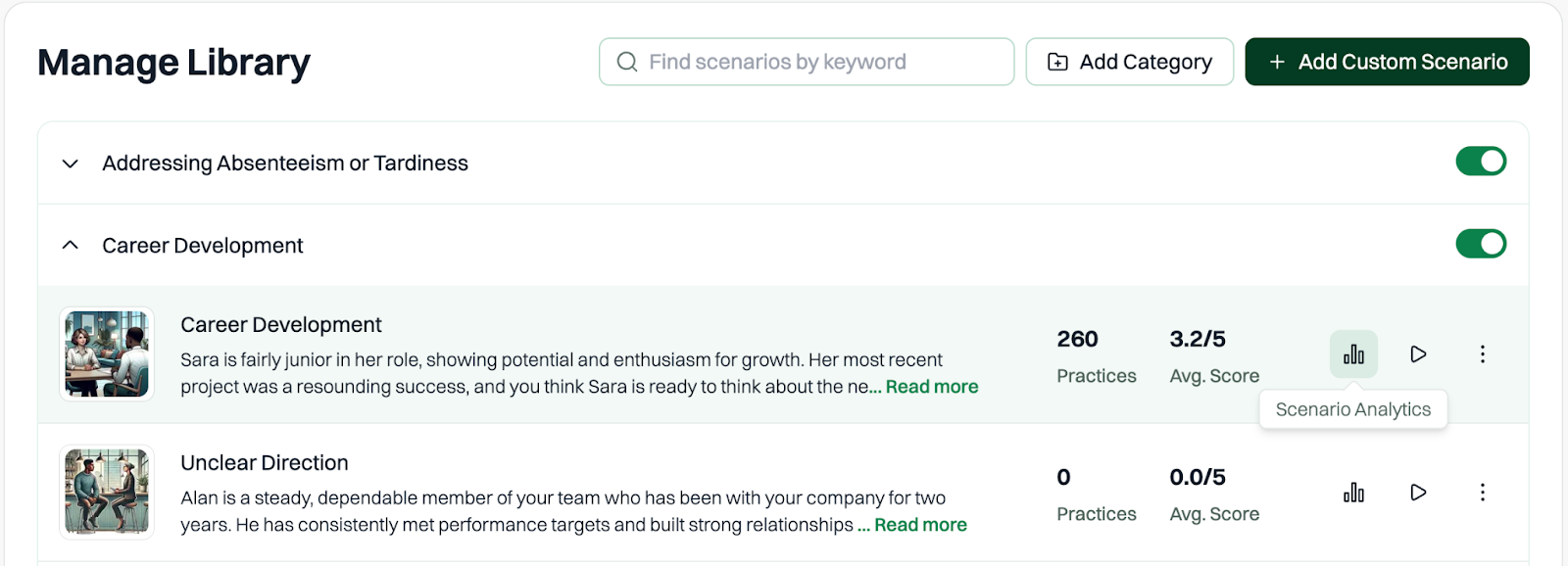
In addition to the main Analytics tabs, Tenor provides analytics for individual Learning Paths and Scorecards. These are accessible from the detail page of each Learning Path or Scorecard in the Admin Dashboard, and from the list of scenarios under each category in the Manage Library tab, rather than from the Analytics section.
- Scenario Analytics show average scores, practice durations, completion rates, and user value survey responses for each scenario.
-
- Learning Path Analytics show assignment progress, completion rates, and average scores for each step and user.


- Scorecard Analytics show submission counts, pass rates, and per-criterion performance for each scored scenario.

Privacy Protections in Analytics
To protect user privacy, Tenor may hide certain analytics when there isn’t enough data in the selected group.
This also helps ensure the trends shown in Analytics are meaningful — some views require more than a handful of data points to be accurate and useful.
When We Hide Analytics
Most Popular Content – Hidden unless there are at least 10 users in the selected group who have practiced at least one scenario.
User Value Survey – Hidden unless there are at least 5 unique survey respondents.
Most Discussed Topics (Coach) – Hidden unless there are at least 10 users in the selected group who have had at least one coaching session.